

A pivot table serves as a powerful tool to understand complex data. imagine a massive spreadsheet full with figures, where you aim to find patterns, trends, or simply seek rapid answers the pivot table comes to the rescue. It enables you to effortlessly segment, sort, and reorganize your data.
With just a few clicks, you can transform rows and columns of information into clear insights, revealing concealed connections that might otherwise require extensive time to detect. Pivot tables stand as an indispensable instrument for tracking sales, managing budgets, or scrutinizing trends, essentially giving a voice to your data.
In this beginner’s guide, I’ll walk you through:
- What pivot tables are
- Why you should be using them
- Step-by-step instructions to create your first pivot table
- Real-life examples where pivot tables are invaluable
- Advanced features like slicers, charts, and calculated fields
- Common mistakes to avoid
What is a Pivot Table?
A pivot table is an interactive table that allows you to quickly group and summarize large volumes of data. With a few clicks, you can reorganize (pivot) your data to see new summaries and insights.
Imagine you have a giant dataset consisting of hundreds of thousands of rows. Pivot tables allow you to extract specific data points and arrange them in a table for analysis.
For example, raw data on customer purchases can be pivoted into a table summarizing sales by region. A dataset containing survey responses could be pivoted into a cross-tab analysis showing satisfaction levels by age group.
Pivot tables derive their power from their flexibility, allowing users to create customized views and summaries that go beyond the limitations of raw data.
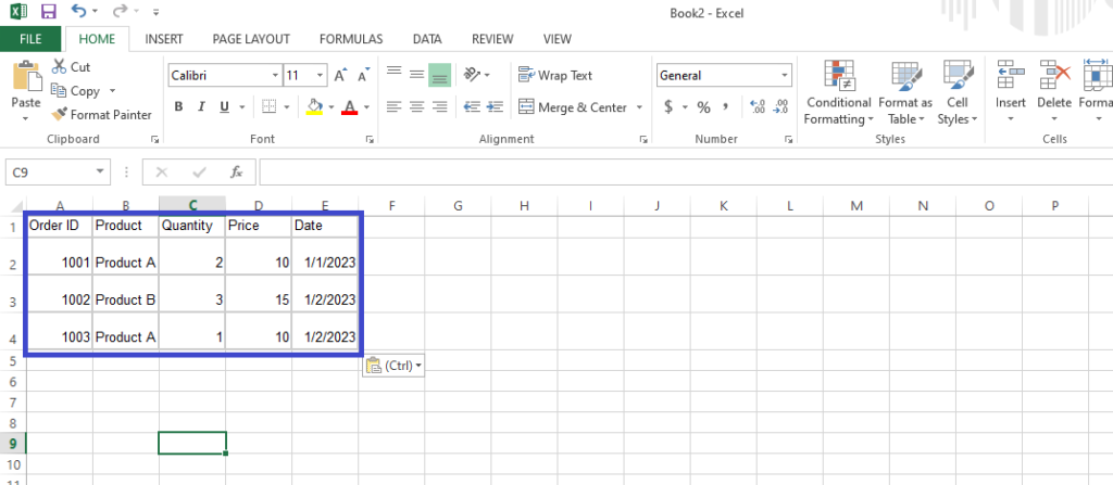
Below is a simple example of raw data being transformed into a pivot table:
Why Should You Learn Pivot Tables? (3 Key Benefits)
- Summarize data instantly
Manually summarizing data is frustrating and time-consuming. Pivot tables let you generate summaries and insights with just a few clicks.
For example, what could take hours of manual effort for a sales manager analyzing revenue by product and region can be done instantly with pivot tables. Marketers can immediately see how campaigns perform across different segments without any manual analysis. Finance teams are able to dynamically view budgets in real-time.
By automating repetitive analytical tasks, pivot tables enable you to focus on other high-value work.
- Spot trends and patterns easily
Pivot tables make it possible to discover trends and patterns that would be nearly impossible to identify otherwise.
For example, seeing revenue broken out by both product and region in the same table makes it easy to identify best-selling products by geographic area. Adding a time dimension can surface spikes in sales of a particular product over time.
Uncovering these kinds of trends manually would require tremendous effort. Pivot tables let you generate multidimensional summaries with a few clicks, allowing key insights to bubble up to the surface.
- Save time and reduce errors.
When manually summarizing or analyzing data, it’s easy to spend extra time double-checking your work, and even then, human error can slip in, affecting the accuracy of your analysis. However, pivot tables streamline the process, reducing both the workload and the potential for mistakes. By automating complex manual processes, pivot tables enable you to work smarter. The hours saved each week quickly add up, giving you more time for strategic tasks.
How to Create Your First Pivot Table (Step-by-Step)
If you have a dataset you want to analyze in Excel, follow these steps to create your first pivot table:
Step 1: Prepare your raw data
Your pivot table is only as good as the raw data you start with. Before importing your dataset into Excel, be sure to clean it up.
- Fill in any missing values pivot tables may not function with blank cells.
- Remove duplicate rows duplicates can skew results.
- Split text values into separate columns, e.g., splitting full names into First Name and Last Name columns. This allows you to analyze data by specific attributes.
- Remove merged cells pivot tables work best with data in tabular format.
With clean, normalized data, you’re ready for the next step.
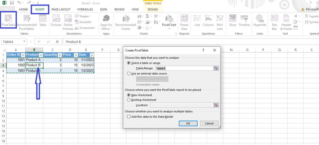
Step 2: Insert a pivot table
To insert a pivot table in Excel:
- Click any cell in your dataset which is the one with arrow bellow.
- Click Insert tab, click “Pivot Table.” A dialog box will appear.
- Make sure your data range is properly selected, and click OK.
You’ve now created a blank pivot table canvas linked to your raw dataset. Next, we’ll add fields.
Step 3: Add fields to the pivot table
Fields represent the attributes you want to analyze the who, what, where, and when of your data. For example, fields might be Region, Product, Sales, Gender, etc.
To add fields:
- On the right side of your pivot table, you’ll see a list of all the fields in your dataset.
- Drag fields from the list into specific areas below. The key areas are:
- Rows: The attributes you want data summarized by
- Columns: Secondary attributes
- Values: The metrics you want to measure
Rearrange fields between areas to see different summaries.
For example, you may drag Region into Rows, Product into Columns, and Sales into Values to view sales broken out by region and product. Feel free to explore the power of pivot tables lies in quickly generating different views!
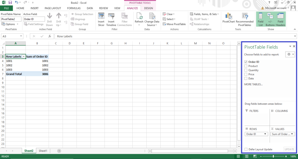
With your fields added, you’ve created your first pivot table! Let’s now look at some real-life examples.
Real-Life Use Cases of Pivot Tables
Here are just a couple of examples of how pivot tables are used in practice:
- Use Case 1: Analyzing sales performance
Sales teams can load their transaction data into a pivot table to analyze performance in powerful ways, including:- Summarizing revenue by product or region
- Comparing 2 or 3 growth rates
- Identifying best-selling products
- Highlighting sales representative performance
By enabling multidimensional analysis, pivot tables help sales managers spot trends and opportunities. Teams can instantly create views on-the-fly during meetings to answer questions as they arise.
- Use Case 2: Analyzing demographics and customer behavior.
For marketing and customer analytics, pivot tables help uncover insights such as:- Which customer segment buys the most of a given product
- How age groups differ in channel preference (e.g., in-store vs. online)
- Seasonal patterns in customer spending
- Demographic breakdown of campaign performance
These insights help retailers tailor marketing campaigns and better understand their customers. Creating the same views manually would be extremely laborious.
Advanced Features of Pivot Tables
Up to this point, we’ve covered pivot table basics but there are tons of advanced features to take your analysis to the next level:
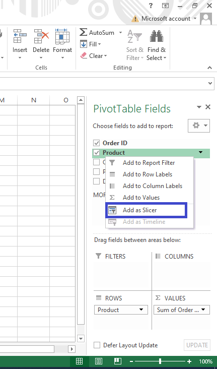
Slicers for dynamic filtering
Slicers create buttons next to your pivot table allowing you to instantly filter and drill into data. It’s a quicker and more interactive way to explore subsets of data.
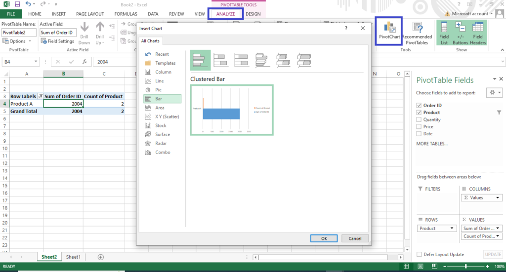
- Pivot charts for visualizing data
Your pivot table data can also be transformed into charts for visual analysis. Just like pivoting the data itself, you can instantly change the pivot chart view for additional insights. - first you click on the analyze icon and click on the pivot chat.
- Calculated fields for custom metrics
For instance, by creating a Ratio field that divides Sales by Profit, you can easily analyze profitability by region within your pivot table. The possibilities are endless. Calculated fields enable in-depth analysis directly inside your pivot tables.
Common Mistakes to Avoid
While pivot tables are easy to get started with, there are some key mistakes to avoid:
- Using incorrect fields
Choose fields that answer your specific question vs. just adding everything. - Cleaning your raw data
Dirty data will lead to erroneous results. Be sure to prepare your dataset before building a pivot table. - Not refreshing after data changes
If your source data changes, your pivot table doesn’t automatically reflect the latest information. Be sure to hit “Refresh” to avoid outdated reports.
By being mindful of these areas, you’ll avoid some of the common frustrations beginners encounter.
Additional Resources to Master Pivot Tables
To recap, here are some resources that can help take your pivot table skills to the next level:
- Downloadable practice dataset – Get hands-on with sample data
- Advanced online courses – Learn advanced techniques like scripting and macros
- Excel pivot table templates – Download templates for common reporting scenarios
- Forums – Connect with other users to learn new tips and tricks
With the right knowledge in hand, you’ll be able to extract data insights more quickly than ever. No more manually crunching numbers or cleaning up sloppy spreadsheets. Let the power of pivot tables help you work smarter, not harder!
Conclusion
If you regularly work with large datasets, pivot tables are the tool you’ve been waiting for to streamline repetitive analyses. As you saw, creating your first pivot table is simple, but the benefits are tremendous:
- Instantly generate summaries and insights from huge datasets
- Uncover trends and patterns hidden in your data
- Save hours otherwise spent on manual analysis
- Avoid errors introduced by “spreadsheet gymnastics.”
Today’s world is overflowing with data. Being able to slice and dice it skillfully unlocks a competitive advantage. Learn to wield the analytics power of pivot tables now to boost your productivity and take your data skills to new heights!
What tips do you have for beginners learning pivot tables? Share your advice in the comments below!